
How much do Polish renewables actually earn? Solar and wind capture prices explained
What a MWh of Polish solar and wind actually earns, measured through capture price and capture factor. This post tracks how those numbers have moved since 2020, why wind and solar diverge, and what it means for project economics.
TL;DR
- In 2025, Polish solar captured only 283 PLN/MWh, while wind captured 414 PLN/MWh; the demand-weighted market average was 448 PLN/MWh.
- On a per-MW basis, that means about 310 kPLN/MW/year for solar versus 1,040 kPLN/MW/year for wind, assuming 1100 full-load hours for solar and 2500 for wind.*
- Since 2021, the gap has widened: solar has been increasingly exposed to midday price cannibalisation, while wind has retained a stronger capture profile.
Solar and wind generation
This post looks at how much solar and wind generation in Poland actually earns — using capture price and capture factor to compare each technology against the market average.
Let’s start with a quick overview of how solar and wind generation have evolved in Poland over the last few years. The chart below shows monthly generation for both technologies.
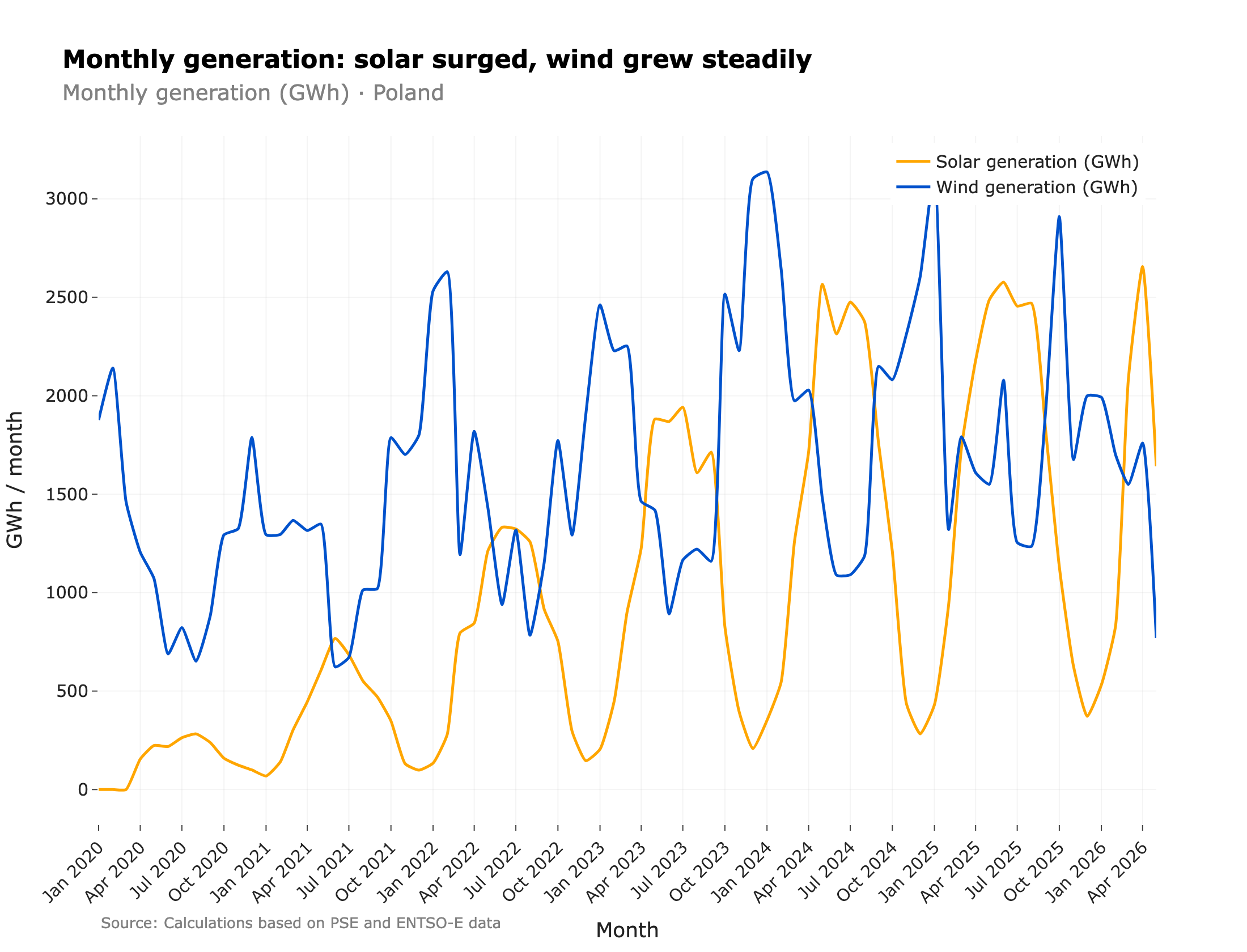
Solar and wind generation have been steadily increasing over the last couple of years. Both technologies show seasonal variability, with solar peaking in the summer months and wind generating the most in winter — a seasonal complementarity that benefits the system. At a daily level, wind generation is inversely correlated with solar generation — very windy days rarely coincide with high solar generation. Days with both low wind and low solar happen fairly often, though, which I described in this post. The extreme cases — little wind and little sun for a sustained stretch — are known as Dunkelflaute.
The share of total RES generation in Poland increased from 12.3% in 2021 to 26.1% in 2025, with solar being the main contributor to that growth.
It is not surprising that such growth has an impact on the power system and market dynamics, which is what I will explore in the next sections. The same growth also shows up on the demand and flexibility side — I look at how temperature and residual-load ramps stress the system in this post on Poland’s electricity demand.
| Year | Solar generation | Wind generation | Share of total generation |
|---|---|---|---|
| 2021 | 4.61 TWh | 15.24 TWh | 12.3% |
| 2022 | 9.29 TWh | 18.77 TWh | 17.3% |
| 2023 | 13.22 TWh | 22.11 TWh | 23.1% |
| 2024 | 17.29 TWh | 23.78 TWh | 26% |
| 2025 | 19.23 TWh | 22.49 TWh | 26.1% |
Table 1: Annual solar and wind generation in Poland and their combined share of total generation, 2021–2025. Source: own calculations based on PSE / ENTSO-E data.
Capture price
To estimate how much a solar or wind installation would earn over a given period, say a year, we need to know how much energy it generated and at what price. The amount of energy is straightforward to estimate from weather data and installed capacity, but what about the price? That’s where capture price comes in.
Capture price is one of the metrics used to measure the value of energy generated by a given technology. We need such a metric because the value of a MWh depends on when it is generated — a MWh generated at 7pm on a sunny day is worth more than one generated at 3am, and non-dispatchable sources generate unevenly through the day. Capture price reflects this time-varying value by taking the average price a technology receives, weighted by how much it generated in each hour.
Where is the price in hour and is the generation in hour .
It’s handy because it gives a single number that summarizes the value of a technology’s generation, and it can be compared to the market average to see if the technology is earning a premium or a discount.
Capture prices since 2020
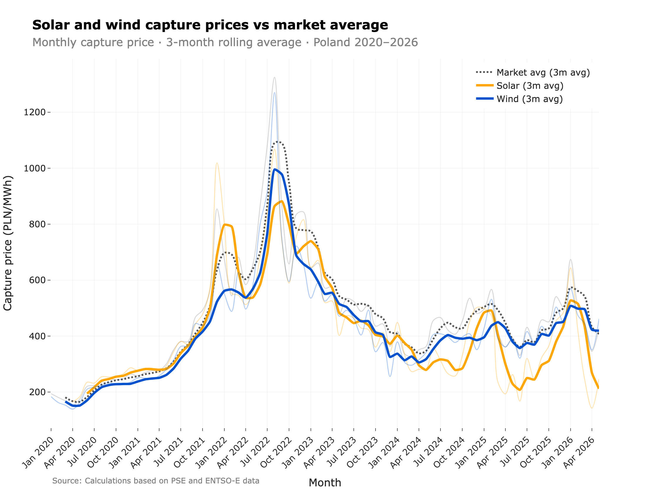
The chart above shows how wind and solar capture prices have evolved in recent years, with the dotted lines marking the market average. Prices are low and stable in the early part of the chart, then jump sharply in 2022 (the energy crisis), followed by a period of elevated and more volatile prices since 2024.
Let’s focus on the period from 2024 onward, as it is more representative of the current situation. Wind capture price is more stable and trending slightly upward, while solar capture price swings widely between winter highs and summer lows.
| Year | Solar capture price | Wind capture price | Market avg |
|---|---|---|---|
| 2020 | 235 | 194 | 214 |
| 2022 (peak) | 714 | 651 | 796 |
| 2025 | 283 | 414 | 448 |
Table 2: Solar and wind capture prices vs demand-weighted market average in Poland, selected years (PLN/MWh). Source: own calculations based on PSE / ENTSO-E data.
Why the absolute number isn’t enough
- 2022 capture prices were high because the market was high (gas crisis), not because the generation profile improved.
- To strip out market-wide moves and compare across years, the ratio matters more than the level — that’s the capture factor.
Capture factor
Capture price is useful to understand how much a technology earns in absolute terms. In order to understand how it performs relative to the market, we can use the capture factor, which is the ratio of the capture price to a reference market price.
- A capture factor of 1.0 means the technology earns the average market price.
- Below 1.0 means it earns a discount; above 1.0 means it earns a premium.
Capture factor is useful because it strips out market-wide price moves and lets us compare a technology’s relative performance across different time periods. For example, if the market price doubles but the capture price also doubles, the capture factor stays the same, telling us the technology’s relative performance hasn’t changed.
How solar and wind capture factors have changed since 2020
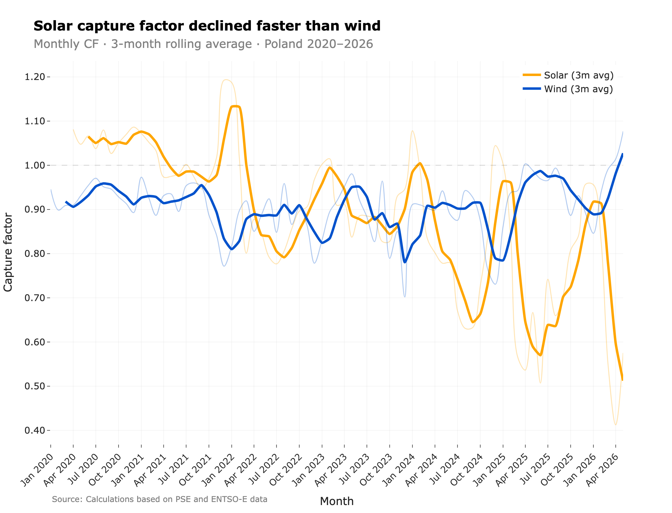
There are a couple of things we can see in the chart above:
- Solar and wind capture factors tend to move in the opposite direction: the lower solar’s capture factor, the higher wind’s — and vice versa. This can be seen as a sign of the solar-induced price profile being beneficial for wind, which can sell part of its energy at higher prices in the evening hours.
- Wind capture factor tends to slightly increase over time, with the spring months of 2026 even above 1.0. Solar capture factor, on the other hand, has been on a steady decline since 2021, with the gap to the market average widening significantly from 2023 onward. The lows get lower each year starting from 2023. In April 2026, the solar capture factor fell to around 0.41. I look at the mechanics of this solar decline in more detail in a dedicated post on Poland’s solar generation boom and falling capture factor.
Why the timing of generation matters
Wind’s stronger capture factor comes down to when each technology generates. The chart below overlays the average hourly generation profile of solar and wind on the average day-ahead price across the hours of the day.
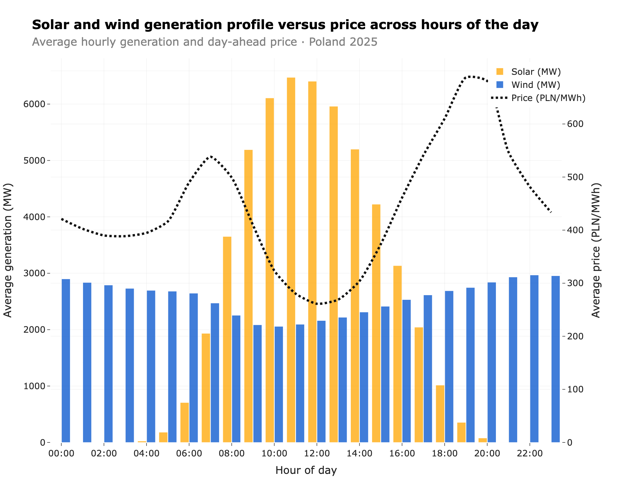
Solar generation is concentrated in the middle of the day — exactly when its own output pushes the day-ahead price down to its daily low. Wind, by contrast, generates fairly evenly across the day and a little more in the early morning and evening, when prices tend to be higher. Because wind delivers a larger share of its energy into higher-priced hours, it earns a higher capture price — and the higher capture factor we saw above.
Where on the price curve renewables sit
Aggregate view: where each MWh lands
This is a visual representation of the capture factor. If solar and wind had a capture factor of 1.0, their generation distributions would match the total generation distribution (line). Instead, solar is heavily skewed toward low-price buckets (left side), while wind is more evenly distributed — also leaning toward lower prices, but much less than solar.
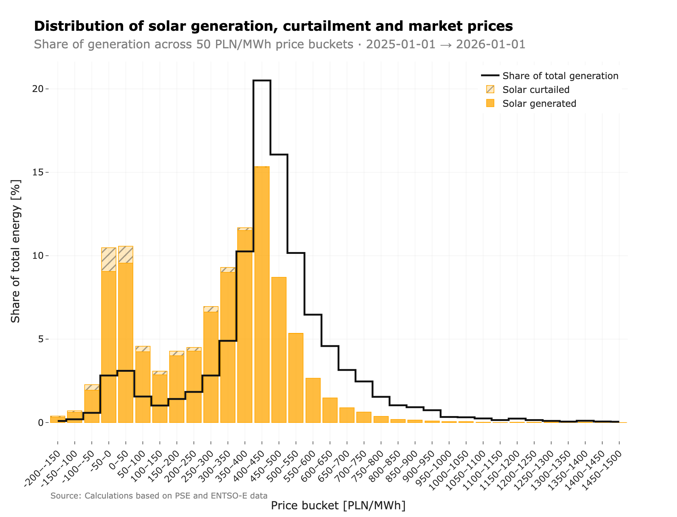
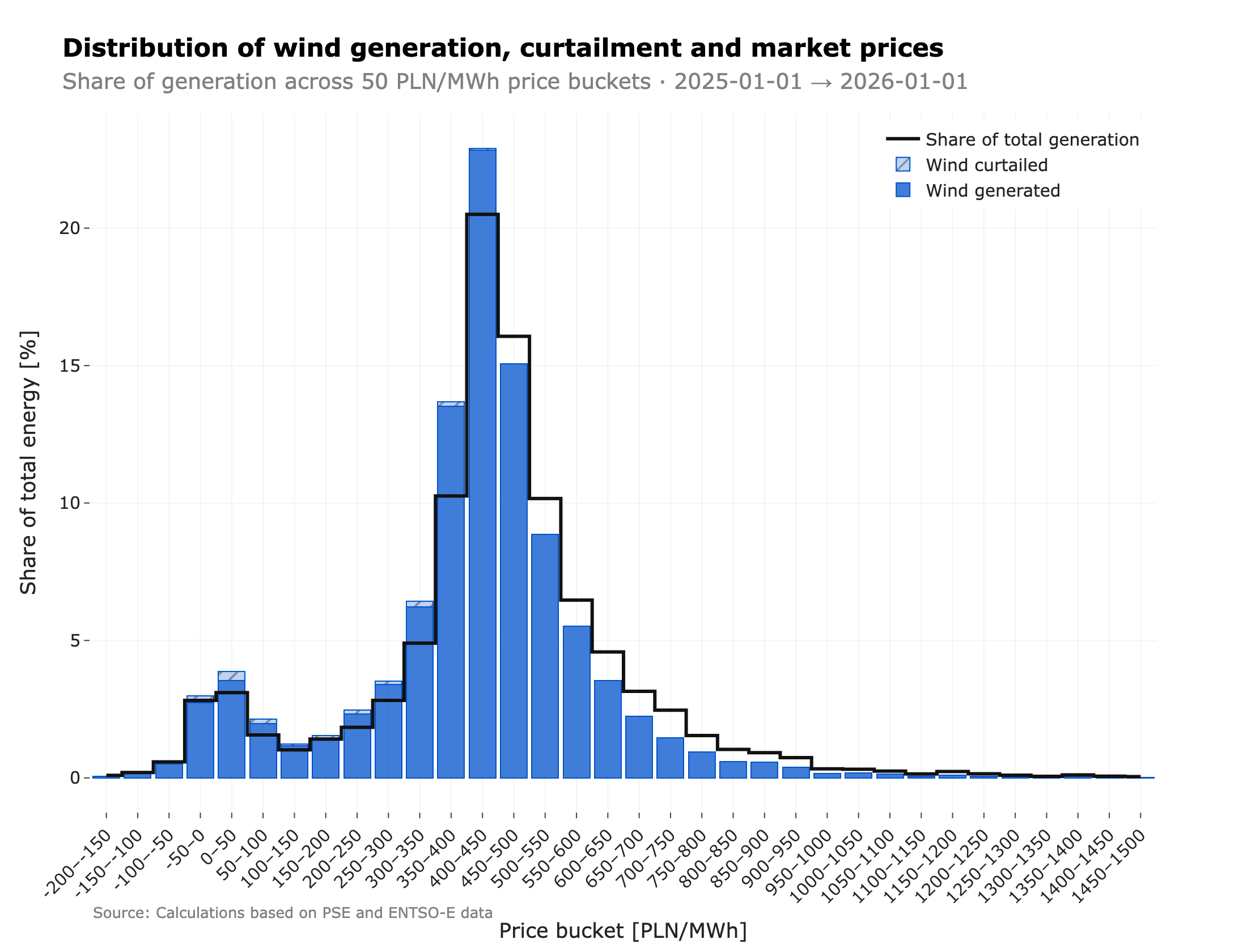
The shaded bars also show where curtailment lands on the same price curve. The instinct is that renewables only get curtailed when prices turn negative, but the data says otherwise: most curtailed energy is lost while prices are still positive. In 2025, 56.4% of solar curtailment (554.4 GWh) and 78.6% of wind curtailment (310.3 GWh) occurred in positive-price hours, against just 427.9 GWh and 84.7 GWh in negative-price hours.
What flips is the intensity. The curtailment rate — the share of available output cut within a given price bucket — runs roughly four to six times higher when prices are negative: 14.39% versus 3.22% for solar, and 8.88% versus 1.42% for wind. That is what we would expect — negative prices signal oversupply, so the system curtails more aggressively — but those hours are too rare to dominate the total. The bulk of curtailed MWh, and the revenue attached to them, is given up while the market was still willing to pay.
How the lean has evolved year-on-year
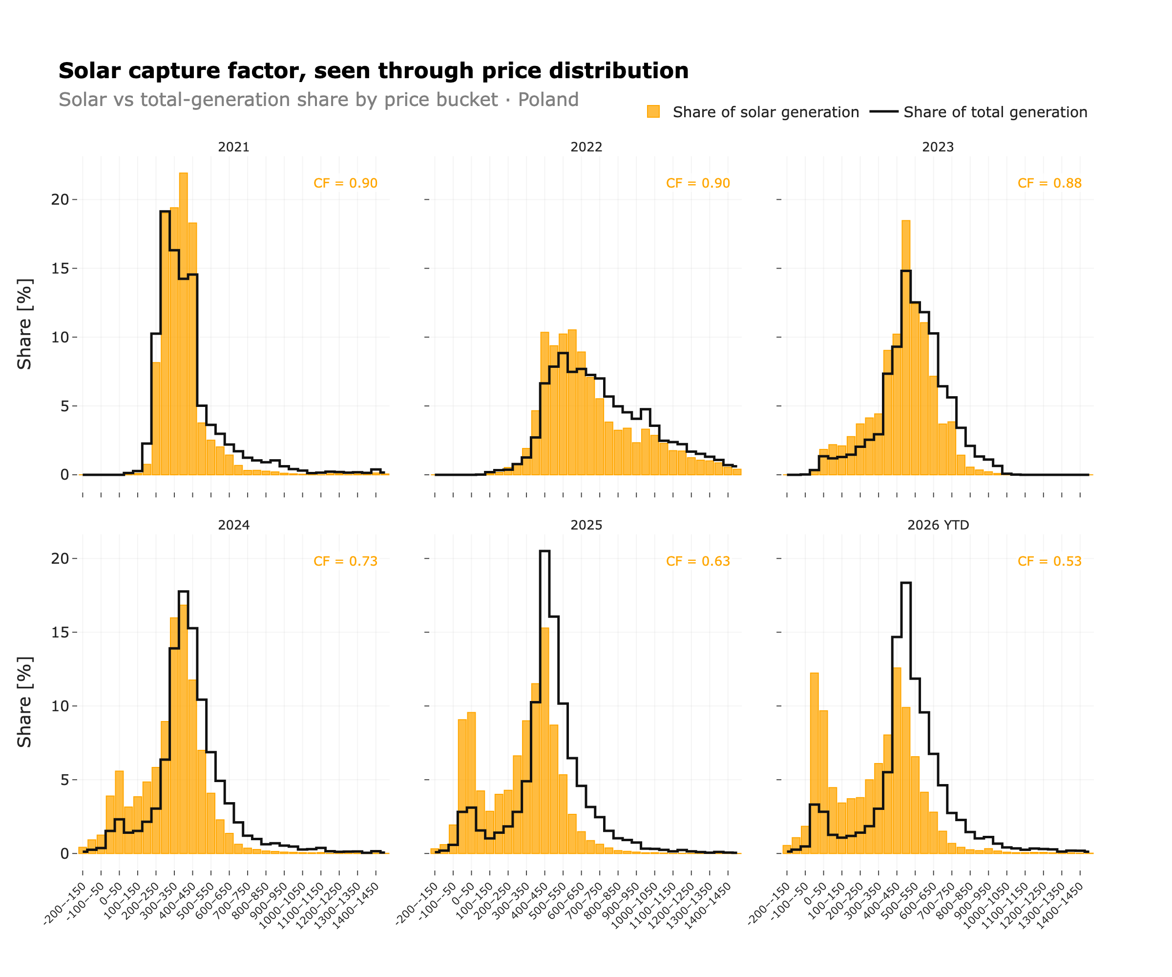
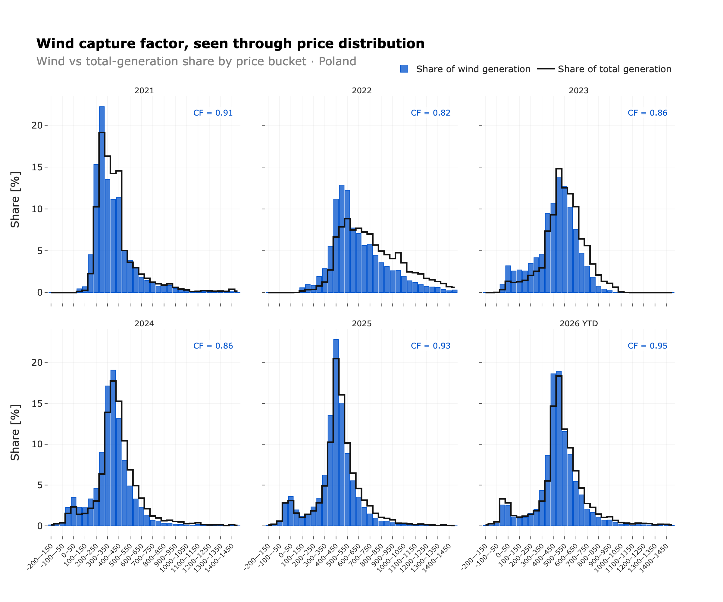
These two charts show how the solar and wind distributions have evolved over time. The solar distribution has become more skewed toward low-price buckets, especially in the last two years, while the wind distribution has remained more stable, with only minor shifts.
Methodology
Data sources. Generation data from PSE (Polish TSO) and ENTSO-E Transparency Platform. Day-ahead prices from PSE (RCE) — a volume-weighted average of the two DA auctions (TGE fixing I and SDAC).
Gabriel Ziembicki — empirical research on Poland’s energy markets.
* This is revenue, not EBITDA. After land lease, O&M, balancing, insurance, grid fees, curtailment losses, aggregator/PPA margin and debt service, the net cash flow can be materially lower.
Get new posts by email
Empirical analysis of Poland's power markets and the energy transition, delivered when new posts go live. No spam.
More posts
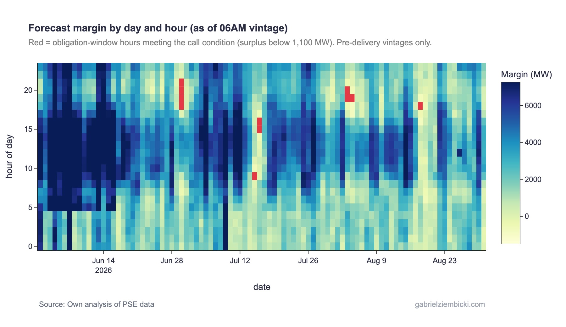
What actually happens when Poland triggers a capacity market call
Poland's capacity market (rynek mocy) was called three times in the summer of 2026 — more than in the previous five years combined. I reconstruct the capacity market call trigger PSE publishes, compare the three call days with similarly stressed days on which no call was declared, and show which factors actually drove the margin shortfall.

How Residual Load Shapes Wholesale Electricity Prices in Poland
Residual load — demand minus wind and solar — is the single best lens on Poland wholesale power prices from 2020 to 2025. Year-by-year evolution, the rise of negative prices, and the month × hour price-sensitivity surface that anchors what-if analysis.
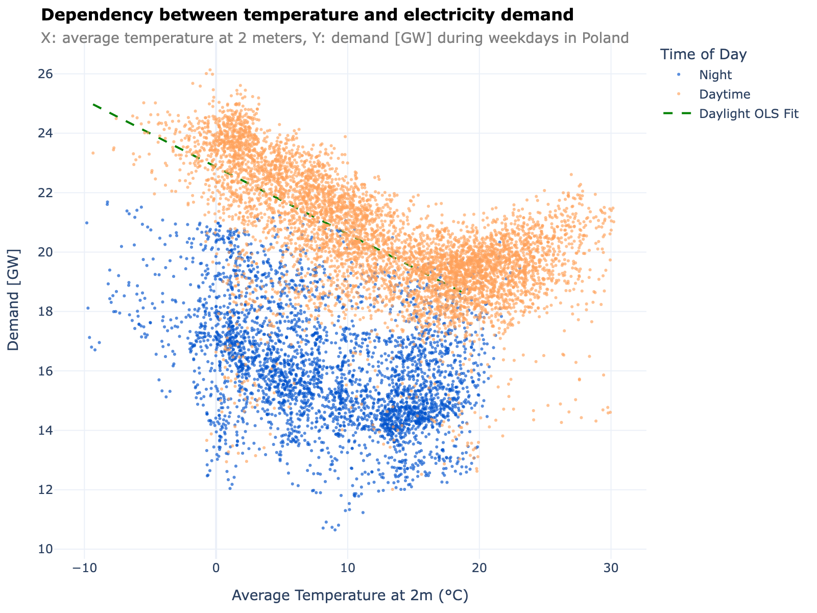
Poland's electricity demand: what temperature and ramps tell us about system stress
Demand in Poland follows a clean two-regime temperature curve with a comfort minimum at 16.5°C and a heating-side slope of 0.213 GW/°C. Residual-load P99 1-hour ramps reached 3.22 GW in 2024–2025 and will likely grow further with PV. A quantitative look at both.